BLNCD NATURALS
BRAND NARRATIVE + AESTHETICS →
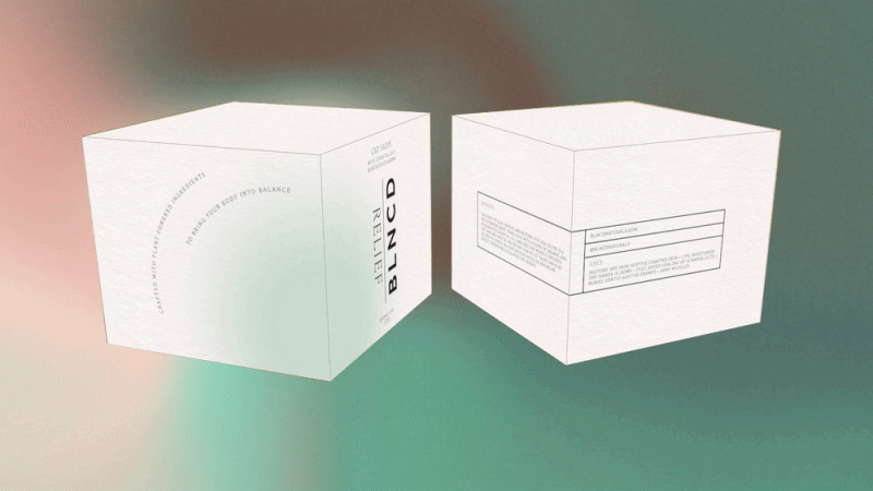
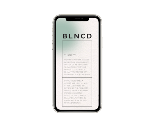
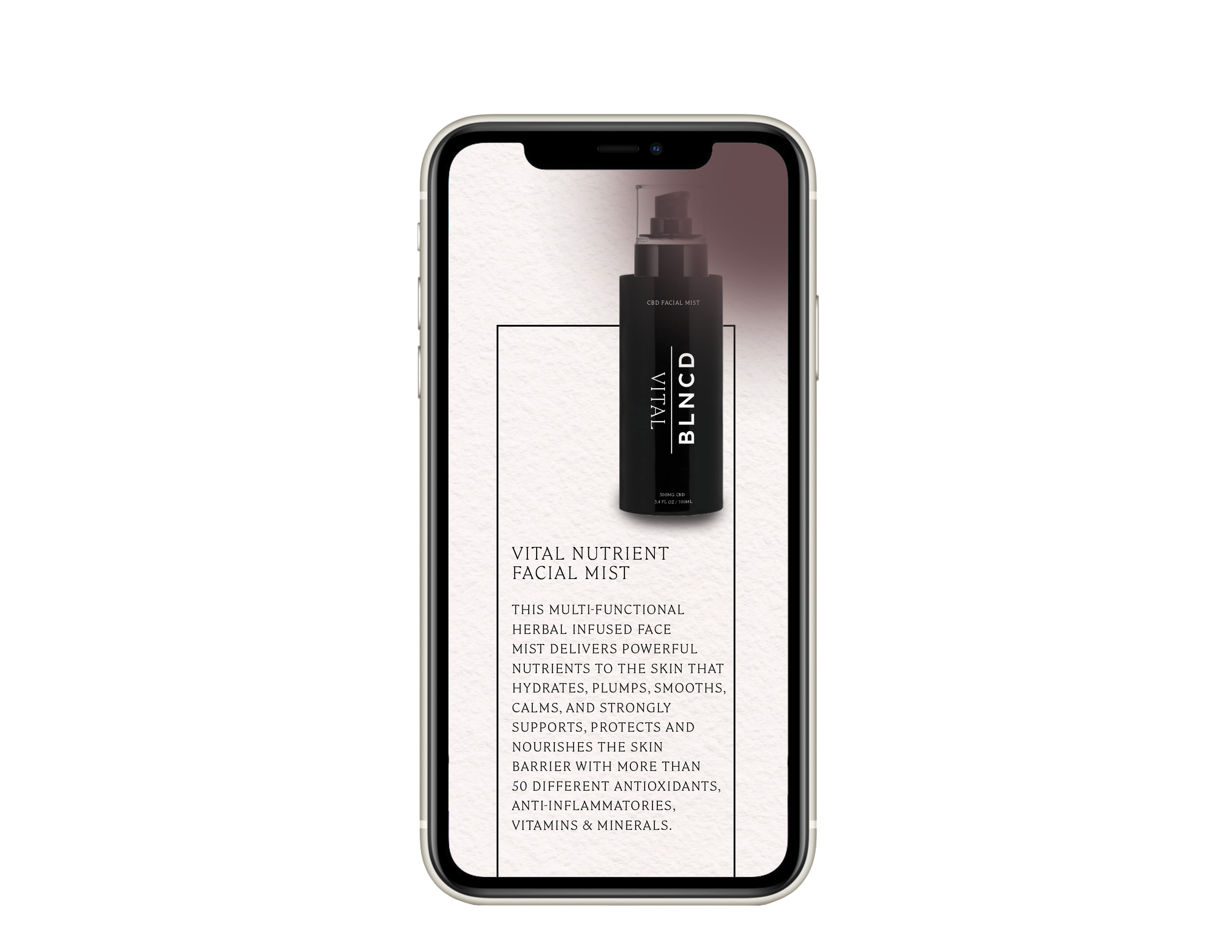
BLNCD Naturals is a women-owned and operated beauty and wellness company creating high performing luxurious products from plant-based ingredients, including CBD. Their vertically integrated manufacturing process is locally sourced from Midwest-grown organic certified hemp. The BLNCD Naturals team, led by an esthetician, herbalist and chemist, is passionate about the benefits of cannabinoids. We helped BLNCD Naturals strengthen their overarching narrative and integrate a cohesive aesthetic into multiple applications, including digital expressions and packaging.


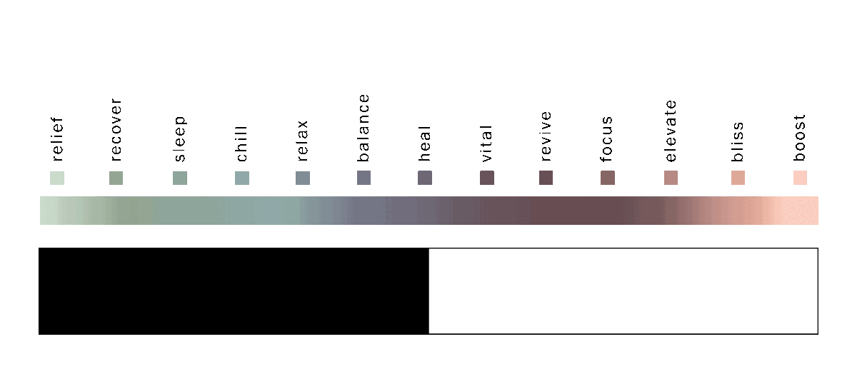
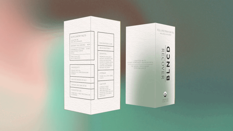
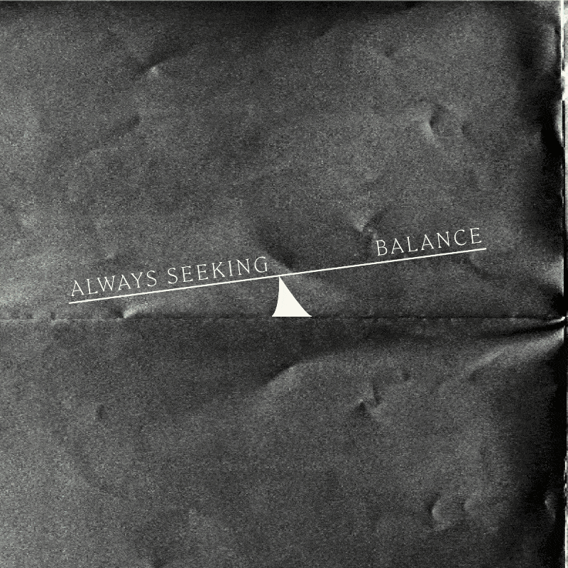
The brand’s mission, bringing the body into balance, is rooted in the research and science of wellness from plants. The array of product blends offer targeted benefits from relief to bliss. The notion of a spectrum is important to BLNCD Naturals, as are concepts of balance and equilibrium. The expertise BLNCD Naturals brings to the hemp and CBD industry can be affirmed aesthetically through the representation of chemistry and manufacturing processes. The use of graphics, diagrams and photography of lab work substantiates the beauty of science and echoes the company value of helping consumers find balance in their lives.
PRODUCT TAXONOMY →
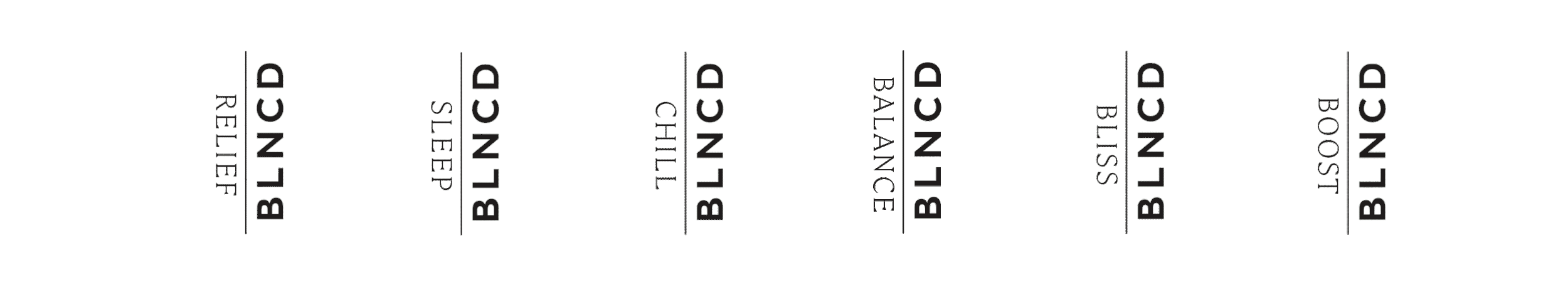
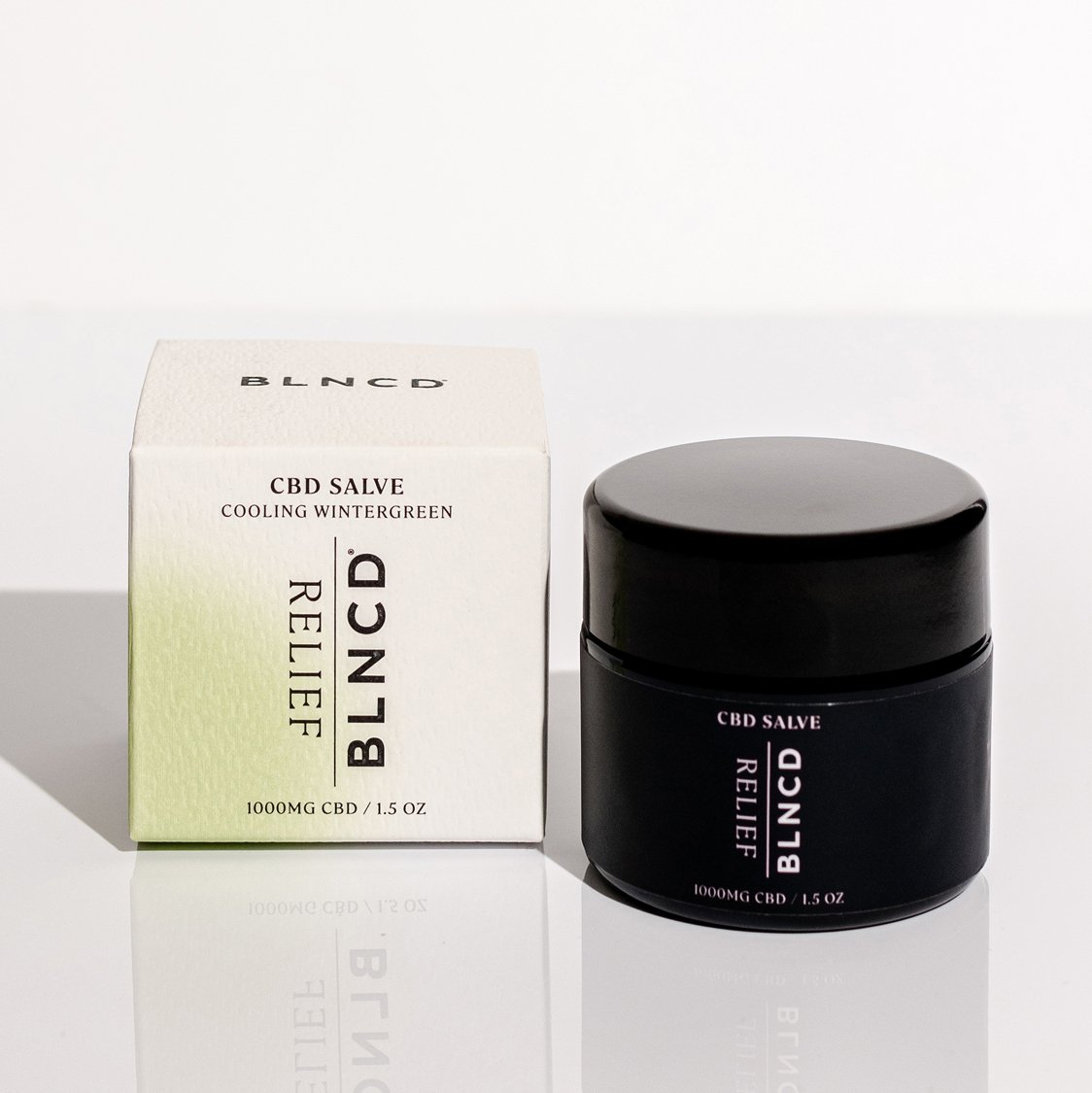
We chose to visually represent this spectrum of offerings as a color gradient ranging from healing blends like Relief and Recover to energizing blends like Bliss and Boost. Each blend receives its own hue on the spectrum, which translates to packaging and digital promotional highlights, reinforcing individual product identity.
The base colors of black and white have been part of the BLNCD Natural brand for years. We chose to continue grounding the brand in these colors, because they emphasize the brands gender neutral territory and allow BLNCD Naturals to operate in both apothecary and beauty spaces.


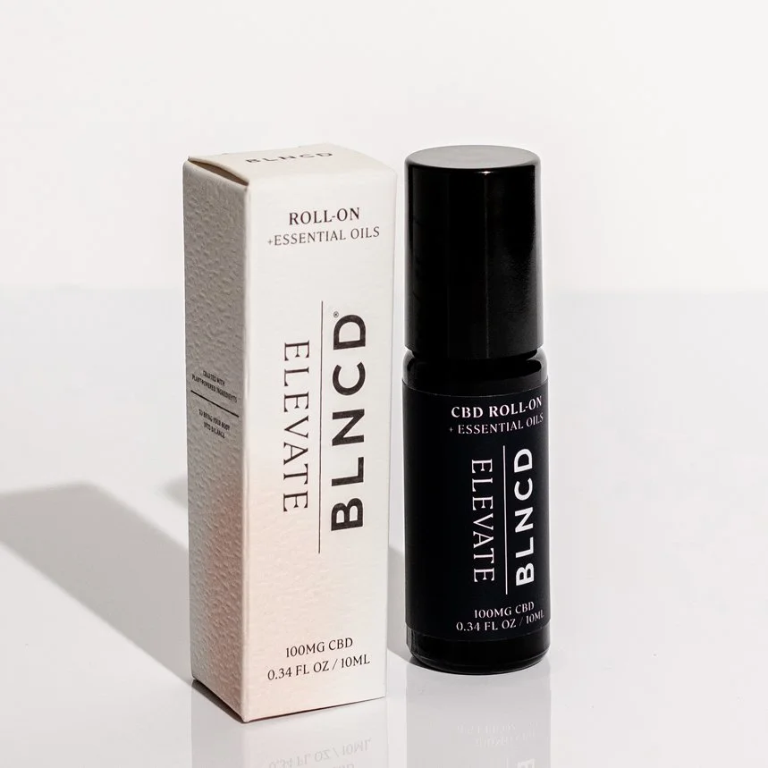
Product photography by Ashley Camper