CASE STUDY: DUST + FORM
PHASE 01 : DISCOVER
LISTENING + EMPATHY → This is the most important part of our discovery process. Through our experience, we have learned that without listening and empathy there is no way unique and original work can be done. Through stories and discussion, we will glean the important nuances and values that make you stand out from the rest.
FOR DUST + FORM THIS CAME TO LIFE IN THESE WAYS →

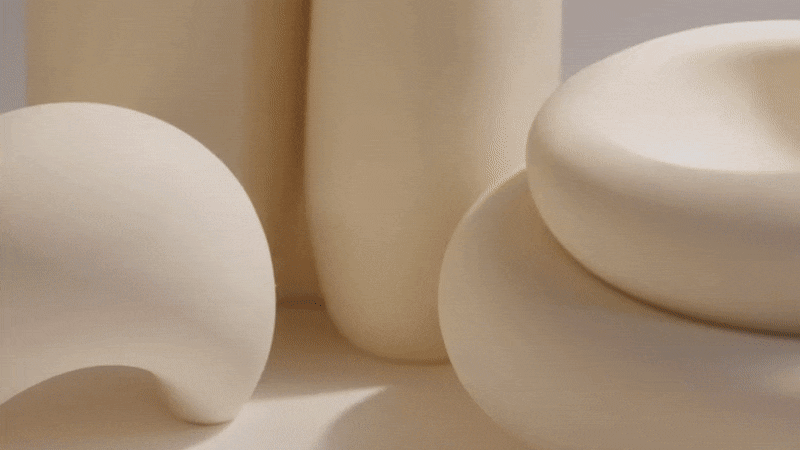
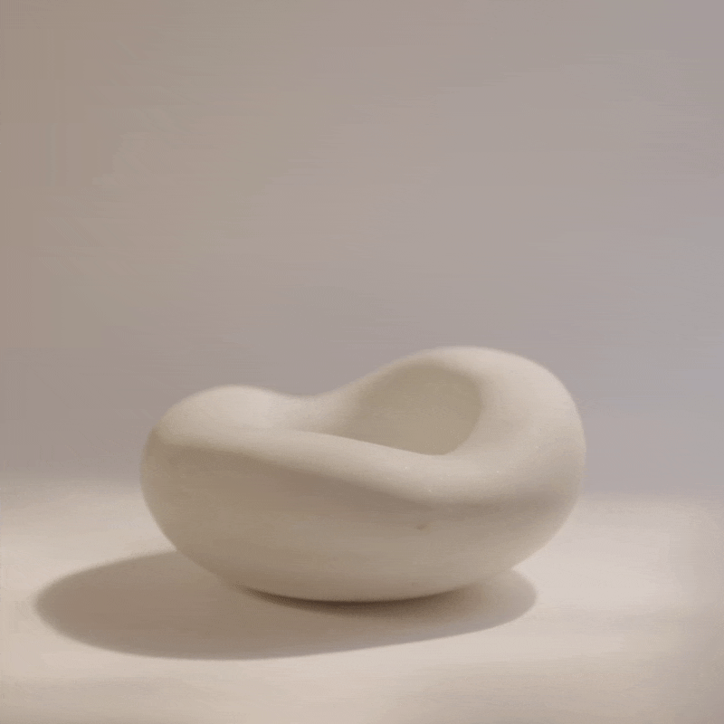
Inherent in the name, Dust + Form, is a focus on material. Brielle Rovito’s unique vision of this is softness. The generative element of life, or reciprocity, from dust to form, is embedded in every expression.
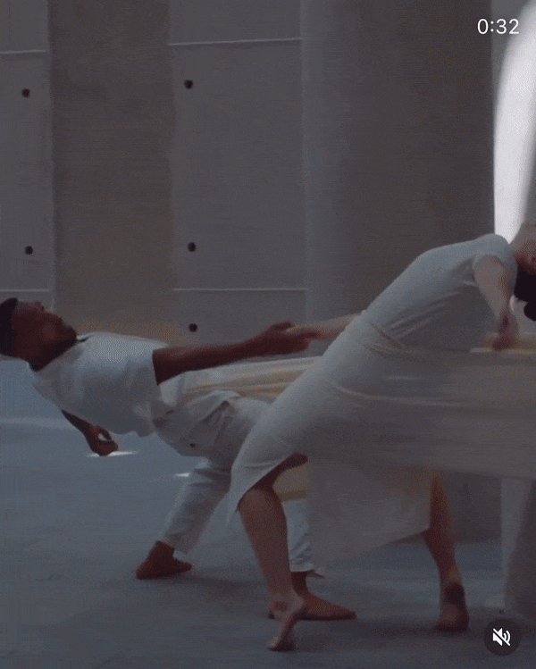
Movement and dance is a key inspiration for Brielle, the artist behind Dust + Form. This inspiration piece we have watched as an intersection of material and movement - something that we want to bring forward in the brand. (Inspiration film by Torben Loth)
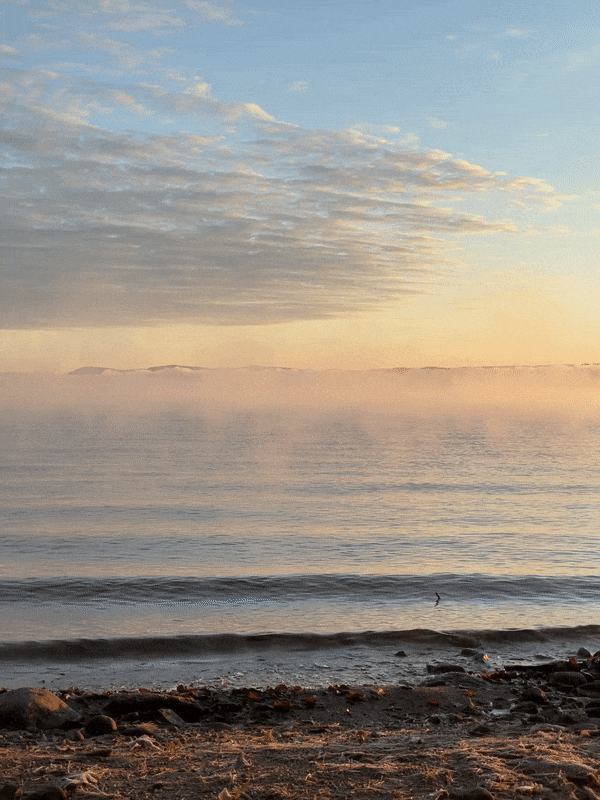
Lake Champlain in Vermont, where Brielle’s studio is located, is a place of peace and grounding for her. This sense of place, or Genius loci, is a wisdom that we wanted to incorporate into the updated visual language.
TREND, CONTEXTUAL + COMPETITIVE RESEARCH → Having a strong understanding of the history, trends, context and competition around the world will solidify a direction that will help you stand out in a crowded market while not deviating from your core values and ethics that are tied to why you started this business in the first place. It’s this research that arms us with all the information needed to make smart decisions and develop effective strategies.
FOR DUST + FORM THIS CAME TO LIFE IN THESE WAYS →
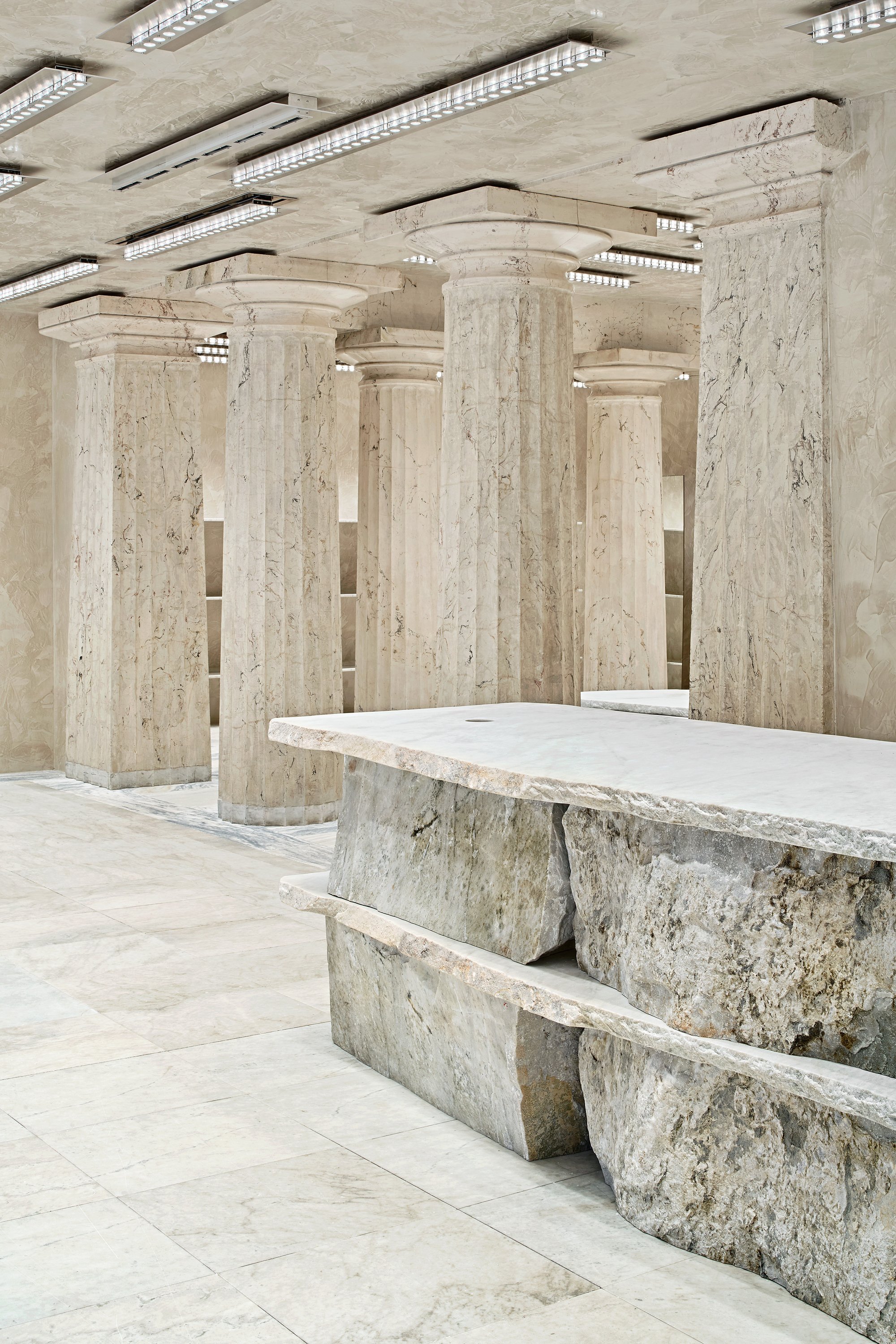
Materiality / When viewing this through the lens of trend, we are really seeing a return to old world, natural materials executed at a large scale. Here, the Acne Studios store in Stockholm is a great example of the textural simplicity that translates to high sophistication we see in many retail + interior projects.
Listening to Nature / Hopefully less of a trend and more of a return to wisdom that is innate in nature, we are seeing a consumer focus on this attribute. Always being careful to not translate this directly into marketplaces to cause more harm to the environment, but rather direct consumers to mindful makers.

Temporality / The fascination of time and material. Like the work of Uta Barth, this adjacency draws the object and the viewer into a momentary exchange. “I keep trying to find ways to shift the viewer’s attention away from the object they are looking at and toward their own perceptual process in relation to that object”
Growth of home category / During the pandemic, the home category has grown exponentially. We view our homes differently, and in many cases, consumers are more comfortable with investing in ways that were previously prohibitive.
-
You can see this in the expansion of many large retailers moving into home (like Zara) but also in the proliferation of artist residencies and incubators like Numeroventi in Florence, Italy. “A contemporary renaissance residency in Florence, Numeroventi aims to provide an experience that activates artistic procedures, by connecting artists and creating space to discover new prisms of their practice. Conceived as a non-profit reality “in-between”, it focuses on supporting artists and designers in their production process.”

PHASE 02 : POSITION
INTENTIONAL APPLICATION → We sweat the details and application of the research and discovery. Every design and communication decision is an opportunity to represent your brand values. That opens the door for your brand to make a serious impact on your business. This intention will be the key in making your business stand out and succeed on your terms.
FOR DUST + FORM THIS MEANT →
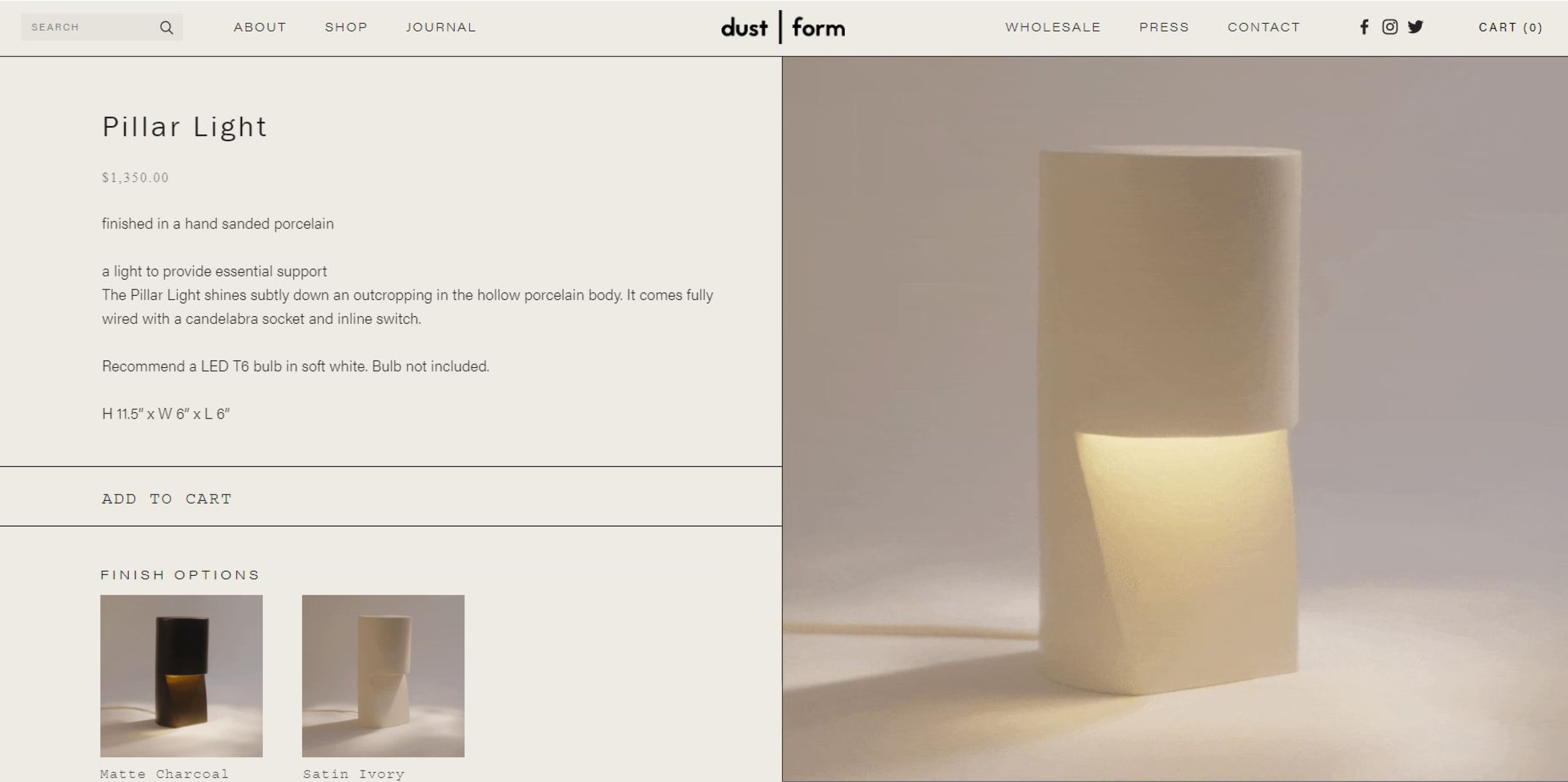
In 2016, we created branding and visual language for Dust + Form that was intended to have a clean, contemporary imprint while also live a long life. The boldness of the marks sets well against the softness of the natural forms within the collections and the material focus of Brielle’s work. Like all of our branding work, we take an editorial mindset that considers a branding ecosystem, as well as a nuanced image language.
NOT ONLY DO DUST & FORM PIECES EMIT A FEELING OF SERENITY DUE TO THEIR SHAPE AND TEXTURES, BUT NEGATIVE SPACE IN IMAGERY AND PIECES GIVE CONSUMERS A MOMENT OF PEACE WHEN USING OR INCORPORATING PRODUCTS INTO THEIR SPACES.


DUST + FORM IS AN EXPLORATION OF TEMPORARY BRILLIANCE
PHASE 03 : EXECUTE
EMERGENT EXECUTIONS → Having a strong creative process brings structure and results. This discipline allows for us to know when to break and explore directions that emerge from the process. Being open to finding and discovering new things allows us to have a process that builds on itself to make something distinctive that clearly communicates your values, story and service.
FOR DUST + FORM THIS CAME TO LIFE IN THESE WAYS →
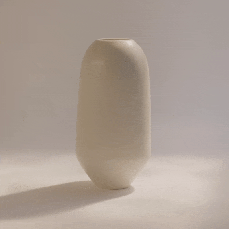
In 2022, we tapped into the temporal relationship Brielle’s objects have with the elements of nature. Specifically, light interacts with her finishes and forms in a very ephemeral, fleeting way. IT IS A VISUAL EXPLORATION OF TEMPORARY BRILLIANCE. As material offering expands within her collections, this visual language not only speaks to the artistic essence but is also functionally useful in differentiating between satin, hand-sanded, marble, and glass.
Architect Peter Zumthor speaks to this “DAYLIGHT, THE LIGHT ON THINGS, IS SO MOVING TO ME THAT I FEEL ALMOST A SPIRITUAL QUALITY. WHEN THE SUN COMES UP IN THE MORNING – WHICH I ALWAYS FIND SO MARVELLOUS, ABSOLUTELY FANTASTIC THE WAY IT COMES BACK EVERY MORNING – AND CASTS ITS LIGHT ON THINGS, IT DOESN’T FEEL AS IF IT QUITE BELONGS IN THIS WORLD. I DON’T UNDERSTAND LIGHT. IT GIVES ME THE FEELING THERE’S SOMETHING BEYOND ME, SOMETHING BEYOND ALL UNDERSTANDING. AND I AM VERY GLAD, VERY GRATEFUL THAT THERE IS SUCH A THING.”

CREATIVE DIRECTION + IMAGE DIRECTION

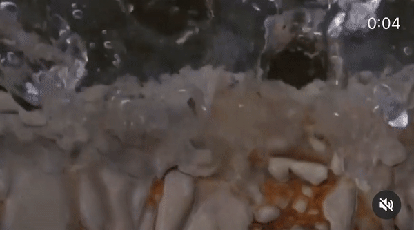
Visual Concept / ACCENTUATE FORMS BY HAVING THEM INTERACT WITH ELEMENTS. BY CAPTURING PRODUCTS LIT THROUGH WATER, THIS IS NOT ONLY AESTHETICALLY DYNAMIC BUT ALSO REINFORCES RECIPROCAL CONCEPTS KEY TO THE BRAND. I.E. BREATH - WE ARE NOT JUST BREATHING AIR ON INHALE, THE EARTH IS BREATHING US ON EXHALE. THE INTERACTION POINT IS KEY.
Photos and videos by Josh + Christina Bernales
DIGITAL TOUCHPOINTS
This website was featured on Squarespace’s blog. You can read more about the project here.
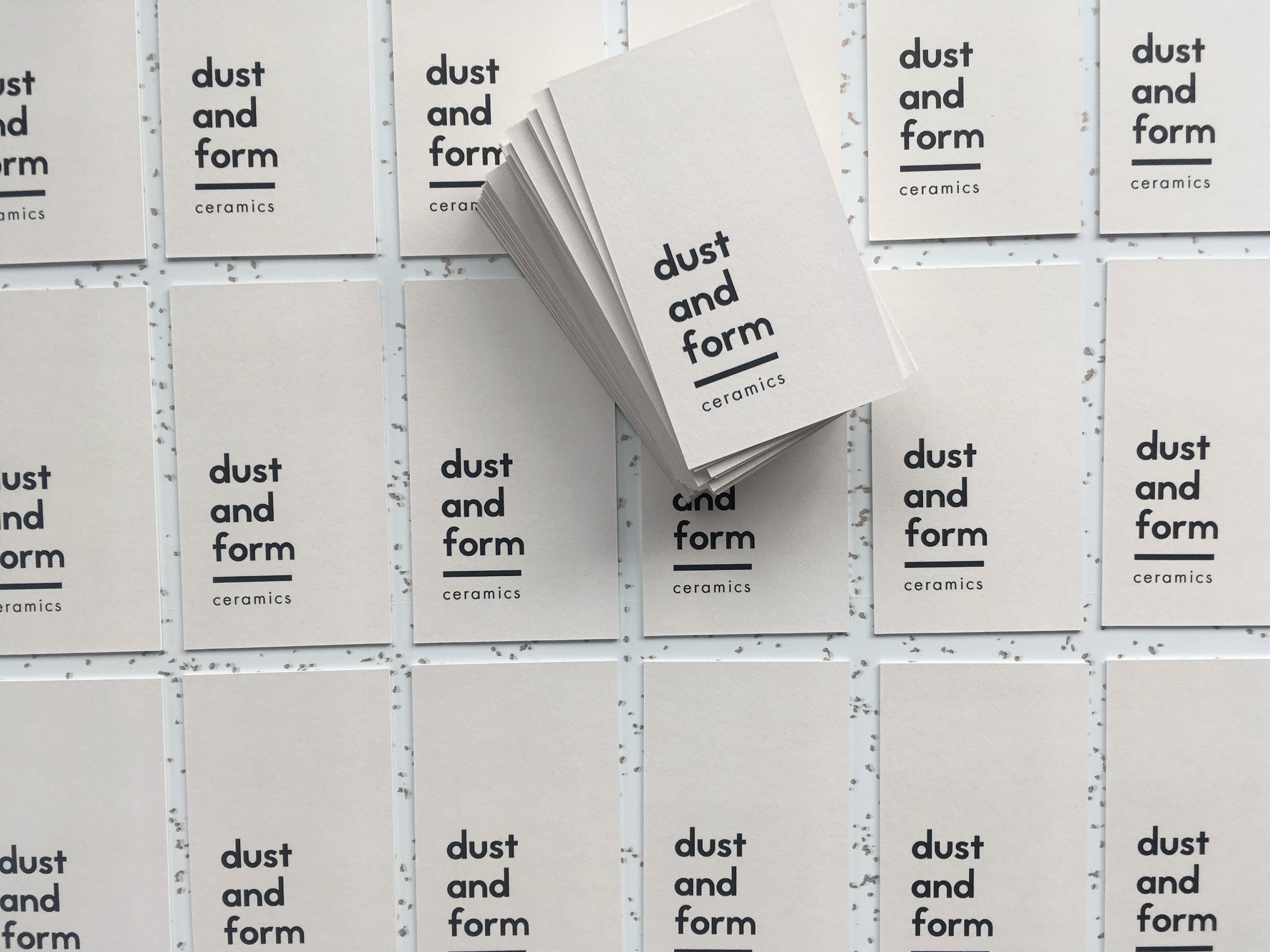
PRINTED COLLATERAL
Images by Beth Cath + Hilary Robertson